This post was originally posted on my Medium. I’m reposting it here to keep everything in one place.
—
TL;DR: This guy (me) has just broken up with his Android first love. He went on with an Apple one. He loves it. He wants to share the awesome experience his new partner brings him. He meant no war. He’s just a blind lover.
—
Disclaimer: I am by no means an Apple affiliate, no #Applefanboy, no Apple-obsessed vlogger, no nothing. I’m just a last year pupil who used to despicably laugh at those who lined up to wait for Apple products.
That hatred… gone with the wind.
I’m not writing this to start a war with Android users, because honestly I still love some Android features that I know Apple will never have, and also, just a safety measure, “all comparisons are just relative”
iPhone doesn’t win in the game of customization, but experience. That’s how the iPhone has won my heart for good.
1. Haptic feedback
In UX design, one of the core principles is feedback. If I were to, I’d definitely give this award to Apple designers for leading the market in haptic feedback.
I’ve used Samsung Note (2,4), HTC (M7, M8), Blackberry Passport (hm… yeah I did…) Sky (a Korean brand), Docomo Arrow X F-10D (I love it!), Xperia (Z2, Z3 compact) (Wait, am I an Android collector or something?).
But nothing came close to the experience that haptic feedback on an iPhone gave me.
In short, it kinda feels like this…

That feedback makes my experience much more “realistic”, in a way that I feel like I have more control, I know the iPhone IS LISTENING to me.
As Don Norman puts it in his all-time-recommended book “The Design of Everyday Thing”:
A lack of feedback creates a feeling of lack of control, which can be unsettling. Feedback is critical to managing expectations, and good design provides this
And Apple, for me, above all other brands, has mastered the art of feedback.
To be more particular, it helps me understand when my action succeeded.
I know when I pull down the newsfeed, I will get a slight vibration, then comes my friend’s newly changed profile picture, then Reddit, so on and so on.
Also when I “back” on surfing Chrome, I get a feedback telling me “Alright man lemme take you back to your previous screen”. “Sure mate, I trust you”.
I don’t ask for it, but it’s so so greattt I can rant about it for a whole day.
2. Smoothness
One would say the smoothness of Samsung Note 9 far exceeds the current iPhone 8 Plus I’m using. I agree.
But as someone who has been through a lot of Androids before, I can’t help appreciating the consistently smooth experience the iPhone gave me.
I can’t recall how many times I have to reboot my Android phones in a day just so I can switch between my notes and my Messenger without having to go around the room stretching for 5 minutes.
I never got to that point in an iPhone. The only time I need to wait for it is its software update :giggle:

I’m not even close to saying that Android phones are slow. All I mean is, after a time of heavy usage, the Android phone can rarely give me the responsiveness like the first days.
Figuratively speaking, an Android is like a new date. She texted me back almost instantly in the first days, but then it gets slower and slower and slower until her constant replies become “seen”. (I’ve actually expressed my frustration about it and how to hack around being “seen”!)
3. Camera
This is my personal opinion, again. The iPhone camera’s quality is so good to me I sometimes mistake it for a DSLR.
In my old Android phones, it takes quite a long time and manual settings just to get a good photo. With my new iPhone, I just take-it-out-and-shoot.
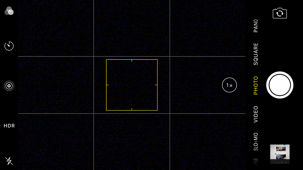
The photos are much more realistic than one taken on any other phone I’ve used (let’s not compare our latest flagship — Pixel 3 and iPhone XS). The camera app UI is clean, focused and intuitive.


So again, with such UI, Apple has delivered me a better experience.
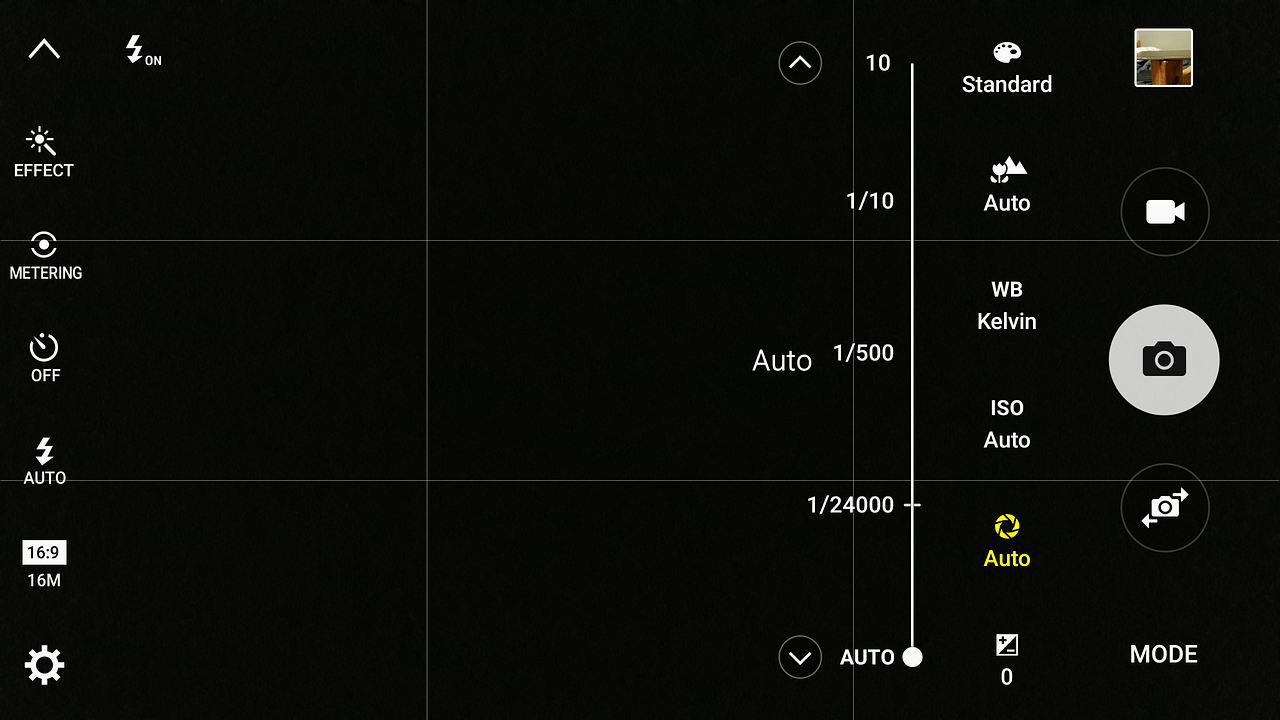
- First, I know where the focus is and where the action should be taken. It’s clear at first sight that if I want to switch between shooting modes, on the iPhone I only need to swipe left/right. However, on other phones, swiping left/right may mean opening selfie mode or changing the filters. In the Samsung case, I had to tap on an icon first, then choose the shooting mode I like. Here in the picture, if I want to change the ISO, I don’t know if I should swipe, or tap (and where). There are no instructions asides from trials and errors.
- Second, Android phones often give me too many options to choose from, which often end up overwhelming me. I like to keep things simple because I’m always afraid I couldn’t take advantage of all of them. Scientifically it’s called Fear of Better Options (FOBO). You can read it more in this wonderful post by Thomas Oppong.
4. And then some
I believe that nowadays there is often a typical framework for everything. The smartphone must have a notch, the sandwich must have 2-bread layers, a pizza must not have pineapple topping.
Therefore, the “magical recipe” of one brand is how they leverage small things to convince users that they do care about them on the deepest level.
I personally don’t consider small details to be that essential until I read this article written by Real Big Words about how only small copies can be the game-changer in bettering UX!
For Apple, the small delightful user experience is their strongest weapon.
- If a friend took your phone and took some pictures, they can’t see other photos in your gallery (whoop!)
- Map: search bar is on the bottom instead of on top, the control center is also swiped from the bottom (thou they bring it to the top since the iPhone X, which is quite sad…Why Apple? Why?).
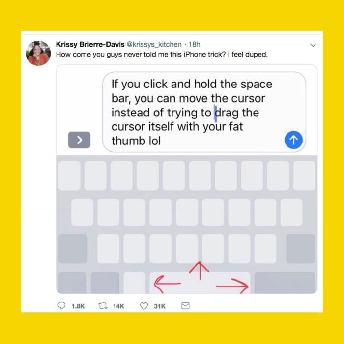
- 3D touch for a quicker reply, app access, download prioritization, moving the cursor anywhere in the sentence (which has driven Twitter mad these days), quick scan barcodes.

You can’t stop me ranting about the alarm next. Yep, the alarm.

The iPhone’s alarm is hands down the most clever alarm I ever get my hands on. Admittedly, it’s not the most beautiful. But why would I care about beauty if I’m gonna be late for work? I’m a utilitarian person.
As you may have noticed, there’s a hierarchy of visibility between the Snooze and Stop button. Why is the Snooze bigger, and yellow, and centered, while the Stop is so much contradictory?
If you are in a half-conscious state, which one are you prone to tap on? A bigger, brighter yellow button whose light manages to invade the smallest crack of your eyes, or a small, almost invisible button down below? Then what? You’re woken again, and again, and again.
It saves your pleasant morning from your boss’s anger, traffic jam, and possible street accidents. Even if you’ve managed to press the right button, you’ve woken your brain. You’re less sleepy now.
If you are in a clear state, there’s no trouble turning it off, is it?
And the keyboard oh god damn it! You can copy your own OTP, email and all the things from the keyboard to the input section without any fuss. I was profoundly taken aback when I first saw my OTP numbers appearing on the keyboard suggestion area.
Why didn’t Android do that?? I could have loved you a thousand years more!
—
How about you?
No matter if you’re an Android or iPhone user, could you share your best user experience with your beloved phone?
Oh and, I may be too biased about my iPhone. It’s great if you can share with me the dark side of its UX as well 🙂


One Comment