And how OkCupid’s UX writers deserve great respect 🙇
Author’s note:
This post was originally published on my Medium. I repost it here to keep everything in place.
I grew bored with Tinder, so I moved to OkCupid for some refreshments.
I did.get.refreshed.
1. “Humanize” the voice
Brands are investing millions in finding the great-great copywriters, because, let’s admit it, if your brand doesn’t have a distinguishing voice right now, you are falling behind (Thanks Erin Schroeder for the great post that inspires me to write!)
Unlike Tinder, OkCupid positions their app to be a human, a wingman, a real sidekick that consults us to choose the best half.
Even though this poses a huge challenge for both the design and the UX writing team, I believe it’s friendlier than the mere concept of a tool.
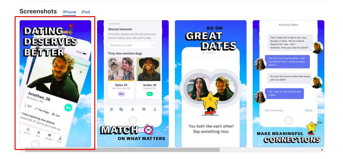
A fun, welcoming splash screen
OkCupid has shown their positioning right from the splash screen (where there are a company logo and introductory elements..) The splash screen is stuffed with all hand-drawn animated items which could be moved around by tilting the phone.
I literally had spent like 5 minutes here to see if I can move them in all directions. Sorry my matches, I had to keep you waiting!

OkCupid’s voice is trustful…
In the “warm-up” phase, OkCupid appears like a very experienced person whose sole purpose is to pass down his/her life-long advice.
“You are about to go on better dates”.
Here, the message is repeated from the store, which is incredibly useful to confirm with users what they are looking for is what they are looking at.
They start with “We” and give me a question. Okay, they are talking to me!
It seems like there’s going to be a guide or something that will help me go on better dates! What kind of awesome wingman is that?
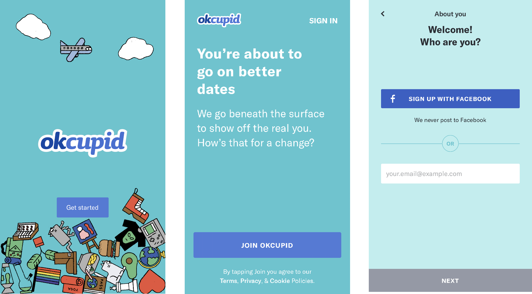
Then came the sign-up screen *sigh*
But, what makes this ever-boring sign-up screen startling impressive to me is the text “We never post to facebook”. During the mist of privacy issues, this is a game-changer! It assures me that I won’t reveal myself to my friends that I’m using a dating app (after all, do we want to?)
What I think could be way better, is a bit more personality. This line of text does not align with the 2 above regarding tone. Ones with a question mark and an exclamation point and one does not.
How about “We never post to facebook 🤞”? (You’ll know why I add emojis later on)
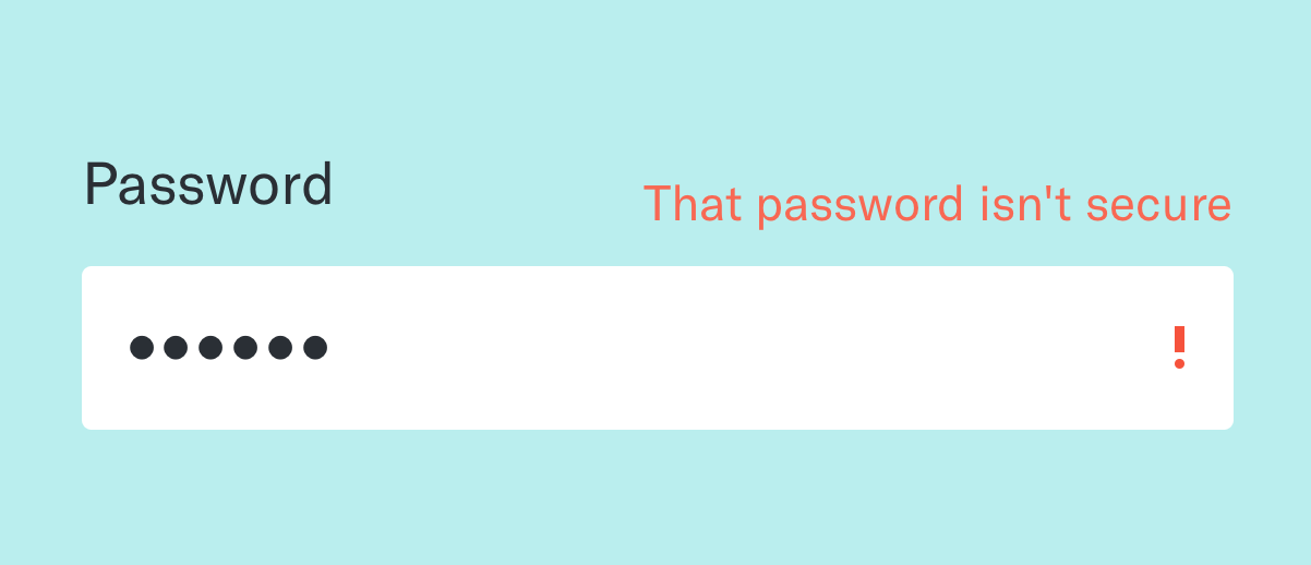
On to creating a password. Here, OkCupid strikes me again!
I was just typing my typical password and pressed done when I saw this little piece of text:
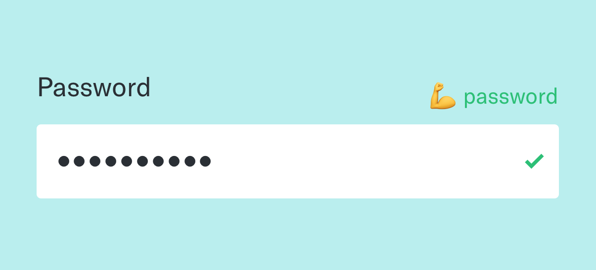
OMG.
How cute is that?? I’m sooo assured again that by signing in with my own mail (well technically it doesn’t need to be) and this password now my account can’t be hacked! The green tick, the “💪 password” is strong feedback that gives the user (me) a positive feeling even when I haven’t really used the app. Well done!
As Don Norman puts it in his book The Design of Every Day Thing, this way of UX writing is the true opposite of poor feedback:
“Poor feedback can be worse than no feedback at all, because it is distracting, uninformative, and in many cases irritating and anxiety-provoking.
Okay, I like you, let me try a simple one like 123456:
Ahh, what I think could be improved is this line. Compared to the last one, too long, and, not as much personality. How about we go: “🙅♂️too simple” or “🙅♂️easy to guess!”. That makes it much better.
…But it’s also naughty!
OkCupid then asks me who I am looking for. Great! One (hopefully) step closer to some beautiful dates!
This is where the app’s personality shines the most.
I got different contents after tapping on different options:
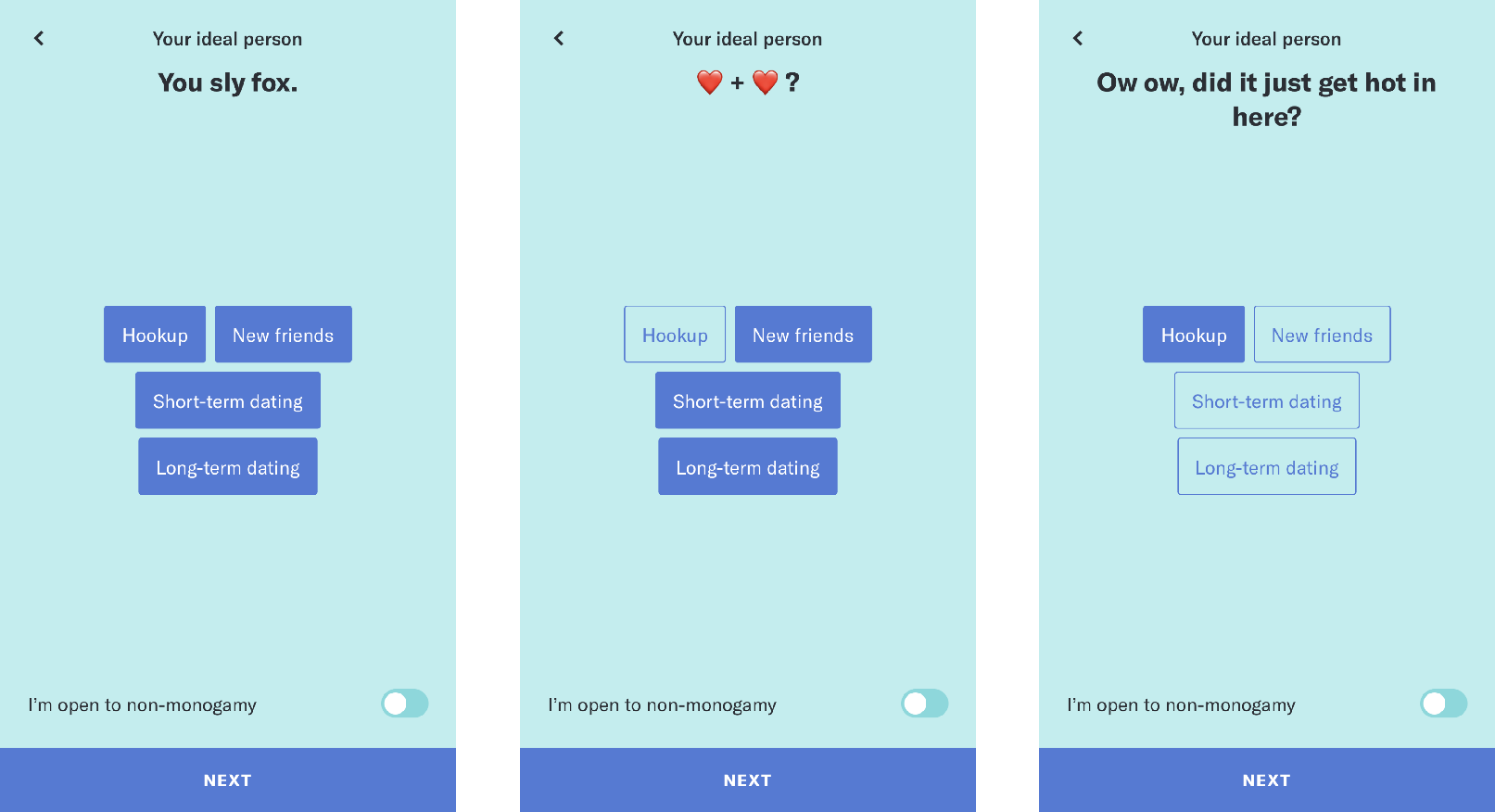
“You sly fox”???
Haha, OkCupid you are a sly fox! Very interesting!
This, hands-down, is the most impressive copy I have ever come across! It’s simple, eccentric but very human.
If you’re inspired already, and tryna find a place to start, I’d definitely recommend learning from the best – Mailchimp.
Voice and Tone | Mailchimp Content Style Guide
2. (Great) attention to details
After filling my basic info, I have to go through 15 questions, each asks me to tap twice (one for me and one for my ideal person).
The questions are designed with various options to choose from, especially genders and religions. These 2 categories receive the most dedication from the team, so much that I even don’t understand some options they provide…
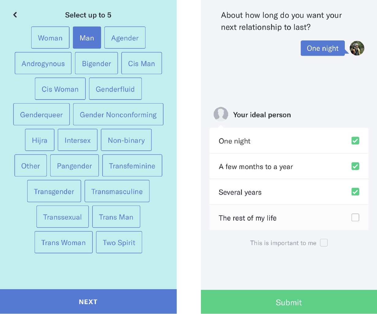
Looking back I can clearly see they’re just making sure the app is following its core value “better dating”.
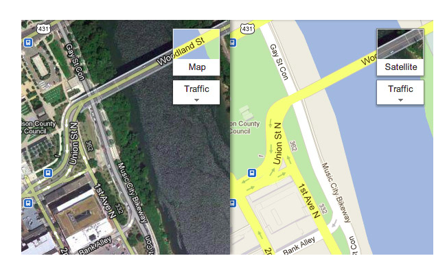
Small details are often ignored by designers, but I believe they bring utter joy if executed properly.
An example of it is Google Map:
Or Tumblr:
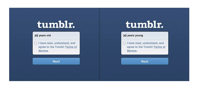
I put up the big names just to emphasize how top-notch the UX team of OkCupid is!
Kudos to the team!
3. Purpose consistency
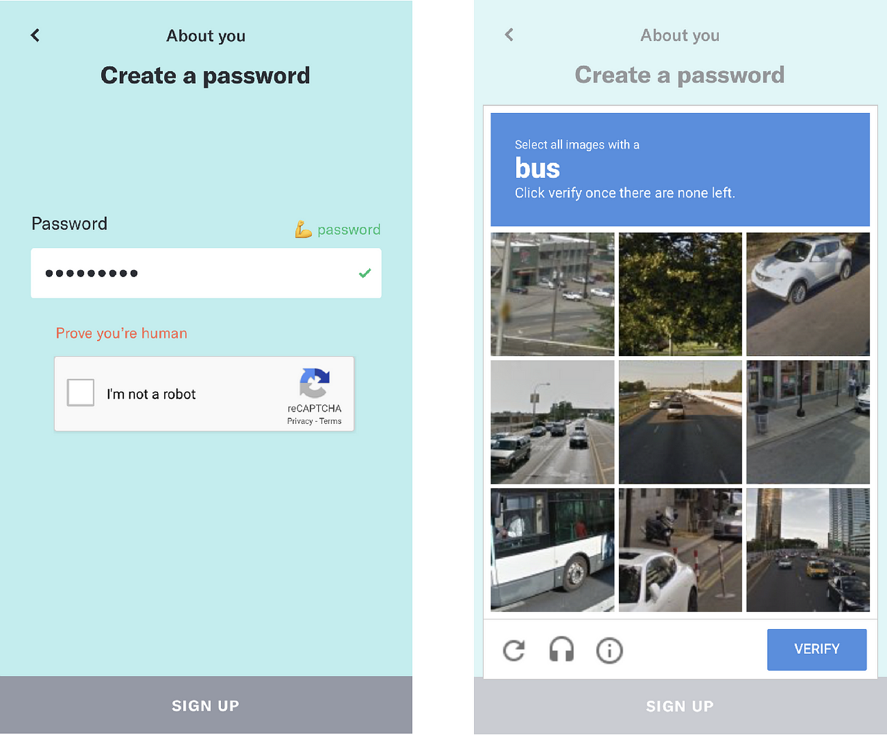
Normally when faced with reCAPCHA and identifying images, I would be mad, like, to the extent that I could drop the whole process and never returned. Unbearable 🐻!
But, it is the built-up understanding of the purpose of the app (better dating) through a rigorous series of steps that hold me back.
It’s not until I came across the reCAPCHA did I realize how consistent OkCupid was in doing what they said they’d do (quite the opposite of their users…)
I don’t know if people can cheat a dating app with bots, but even if it’s not true, a reCAPCHA has acted as a wonderful filter that “swipes left” on those who are not serious.
The “filter” system is even stronger when OkCupid asks you to go through a series of 15 (yes, I repeat, 15) questions googling deep into your interests, religious views, swiping purpose…
—
If you are interested in talking about UX in general or copywriting in particular, I’m very happy to connect!


One Comment